ShopDreamUp AI ArtDreamUp
Deviation Actions


Description
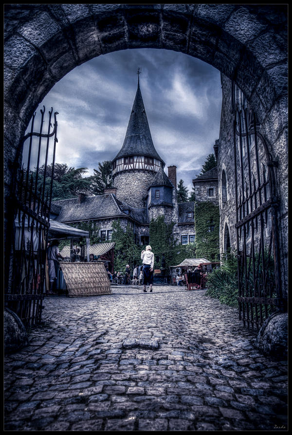
Photograph taken in Belgium / Hergenrath with the canon eos 5D Mark II + canon 24-105 f/4L IS USM + tripod manfrotto 190 XPROB.
Copyright © Behrouz Riahi, allias Zardo. All rights reserved. My images may not be reproduced or used in any form without my written permission.
Copyright © Behrouz Riahi, allias Zardo. All rights reserved. My images may not be reproduced or used in any form without my written permission.
Image size
3837x5711px 15.6 MB
Make
Canon
Model
Canon EOS 5D Mark II
Shutter Speed
1/80 second
Aperture
F/6.3
Focal Length
28 mm
ISO Speed
50
Date Taken
May 21, 2009, 5:29:45 PM
© 2009 - 2024 zardo
Comments115
Join the community to add your comment. Already a deviant? Log In
All of your photos seem to use a very similar technique, one would probably say that this has become your style, and the amazing style that you have practiced and perfected seems to make most of your photos.
Having said this, it seems like the post production technique has become the primary element of your photo i believe that this photo lacks quality composition.
If the subject were the Gates or the Entrance (into the "middle age") i believe that the entrance should have been emphasized more, when first looking at the photo, the tower in the background and the lady in background seem to steal the spotlight , rather that the eyes leading through the entrance (to the middle age), i believe that this takes away from an harmonious composition.
As per normal the post production is amazing, and the colours expressed throughout the photo are aesthetically pleasing and in my opinion make the photo, rather than the composition.
There a few areas of the photo which appear to have been over produced or neglected during the production stage (sky behind the apex of tower, sky behind the upper section of the left hand gate), these areas do not assist with creating a consistent tone and appear to upset the expected colour gradation.
I believe that the concept if great, however could have been expressed more thoroughly from a different angle and with more care.
Hope i haven't offended, am a big fan of your work, especially the earlier stuff.
Keep up the good work.